I am officially State-side! And if you’ve been following me over on Instagram, you’ll know that I promised you a late Get Messy Season of Fairytales Week Three recap on the blog when I get back. Well, here it is.
I absolutely love how these pages turned out! I love how they look yes, but I really love that I created these pages while I was traveling. I’ve never really been able to keep up with art journaling on my travels, unless I somehow merged it with my travel journaling like I did with my Europe 2016 travel journal. But I kept a separate travel journal this time and while working between the two was a bit more time consuming, I’m glad I took my Season of Fairytales art journal with me.
I took a very small stash of things to use in my art journal. So this first spread is reflective of that minimalism. I love how this came out! It’s so soft and wistful. I used a white doily as my center piece and layered and an old book page ripped from an Alice in Wonderland book. I then layered this bird image I got from a Daphne’s Diary magazine over it. I added some fine pen scribbling in the background and sprinkled a few heart stickers about to embellish the page. I added a title journaling that reads “escape to a world of make believe,” which is then accented by a phrase sticker that says “right where I want to be.” Love how simple and fun this turned out.
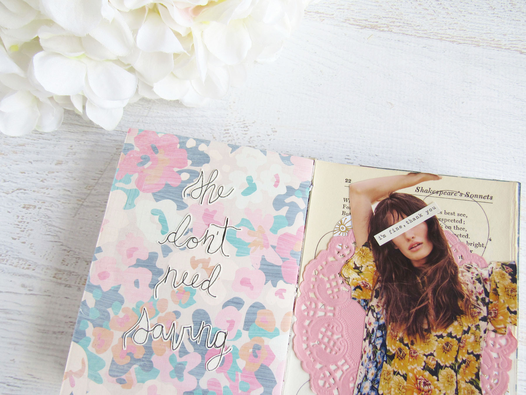
For this next spread, I used a model image that I ripped from a Harrods guide map that I got when my family and I went to visit the mega department store. I just loved her floral shirt, which is saying a lot since it’s a very bold shade of yellow, but something about it was so attractive that I fussy cut the model out to use in this spread. I layered a book page and pink doily behind her, adding pen scribbles, circle stickers, fabric and washi tape to embellish. On the left side of the spread, I left the pattern page intact how I had made it in the journal and just added my journaling.
she don’t need saving
I’m not a huge fan of using images of models that are looking straight on. I don’t know what it is, but something about the eyes bug me. That’s why I usually go for images where the head is tilted or sunglasses or hair covers their eyes. For this one though, I used a phrase sticker that reads “I’m fine, thank you” to cover the model’s eyes and the sentiment just worked out perfectly to add on to my overall statement.
With this last spread, I kind of did two pages next to each other. They work together color-wise, but I don’t think the two statements really go together and it wasn’t my intention that they do.
On the left, I cover the page with an old book page from that same Alice in Wonderland book and simply added this title piece from a Dear Lizzy ephemera pack that reads “the dream is real.” I thought that was so fitting on top of that Alice in Wonderland book page, given the premise of the story.
On the right, I left the floral page how I had made it for the journal and layered a white doily on top. I then took this silhouette of a man’s profile that I got from a Daphne’s Diary magazine and layered it on top. I added a butterfly over where the two edges met and then my journaling with a mixture of stickers and handwriting, which reads: “someday my prince with come” straight out of Snow White. I embellished the page with a few glitter heart stickers just to balance the glitter bits out and that’s it. I’m surprised how well this page came out because I struggled a bit with the placement of my journaling. But I’m really proud of this page too!


