So even though I’m currently traveling through Europe, I wanted to share with you the two spreads I managed to complete for week two of Get Messy Season of Fairytales! I managed to film the process of both of these spreads before I left for you all to enjoy.
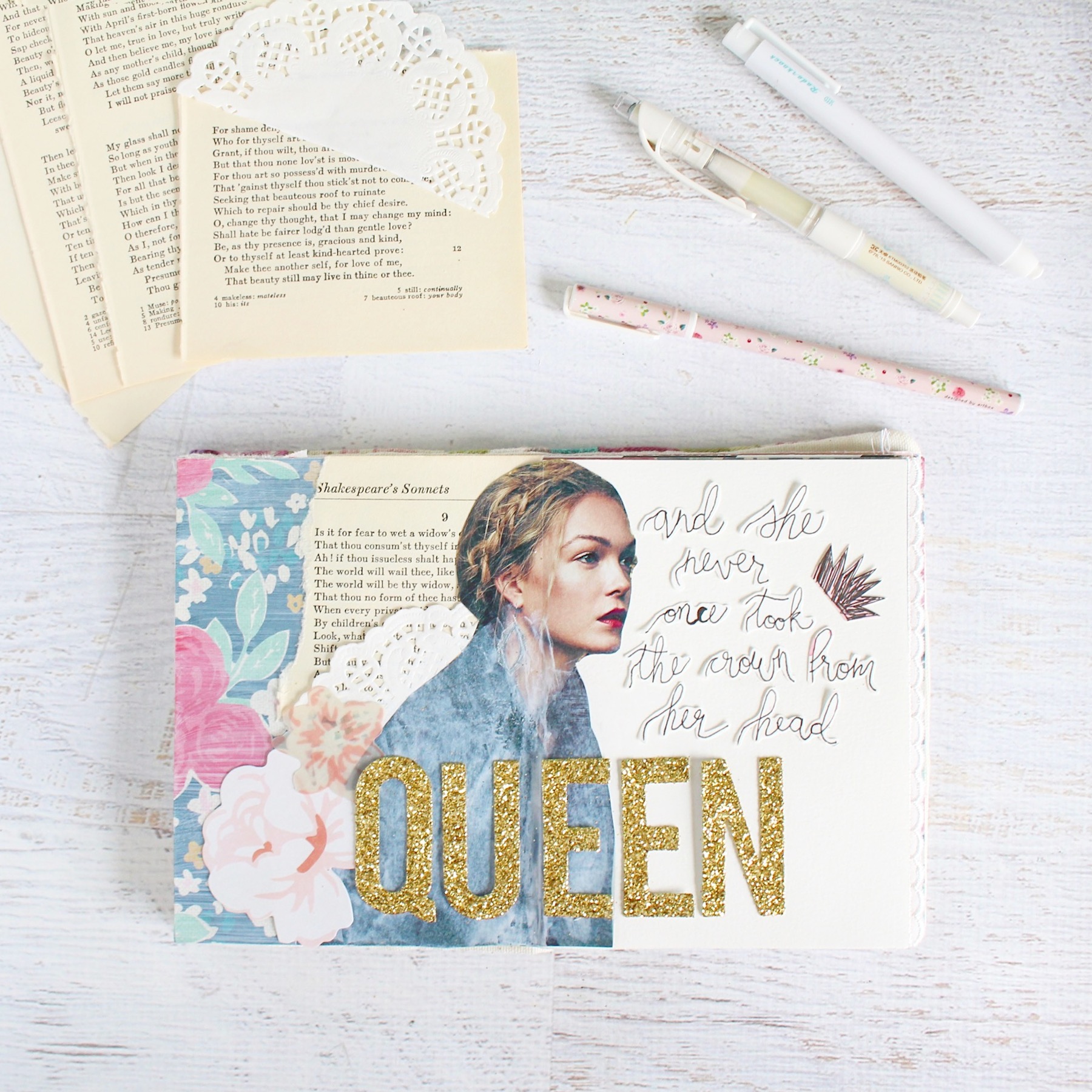
and she never once took the crown from her head
This first spread was inspired mostly by the model image I found in a magazine. I loved the way her hair was braided around her head like a crown. It reminded me of the Suzanne Vega song The Queen and the Solider. I used some torn old book pages, white doilies, and florals on this page. I’m starting to think that they are becoming the staples in this art journal because I use them on every single page. But what really accents this particular page are these huge gold glitter alphas that I used to spell out “queen.” I hand wrote the rest of the lyric by copying a font that I liked from my computer. I absolutely suck at hand lettering, so having something to look at for reference really helps, even if my lettering still comes out looking a bit wonky.

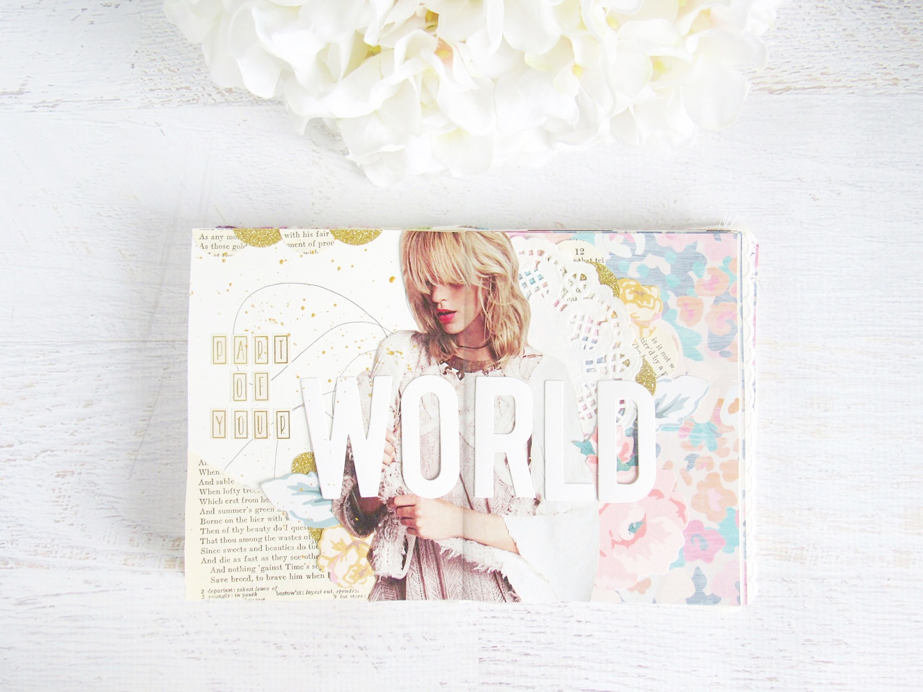
This second spread came out in much of the same way as the first. I was inspired initially by the model image that I found in a Free People catalogue. I just really loved what the model was wearing. Her outfit seemed very ethereal and whimsical. To me, it seemed very princess-y and magical. So I went with that. I was thinking about this week’s prompts as well and all of it combined just reminding me of how Ariel, from The Little Mermaid, wanted to be a part of the human world. Of course the song, Part of Your World, came to mind, so I used that as my title.
I composed this spread like I did the other one. I used an old book page, white doilies and those florals. But I did add a few pen scribbles, some gold glitter washi tape that I cut into half circles, and some gold ink splatters. I ended up using these huge white alphas to spell out “world” and smaller gold alphas for the rest of the title.
I feel like these two spread nicely compliment each other in a way. But I think it’s because I had to work with the pages in my book that were in front of me and they both were similar with the one blank page and the white gessoed floral opposing page. I also used similar alphas for the title, which make them look like sisters. But of course, the Queen is in gold and the Princess is in white.