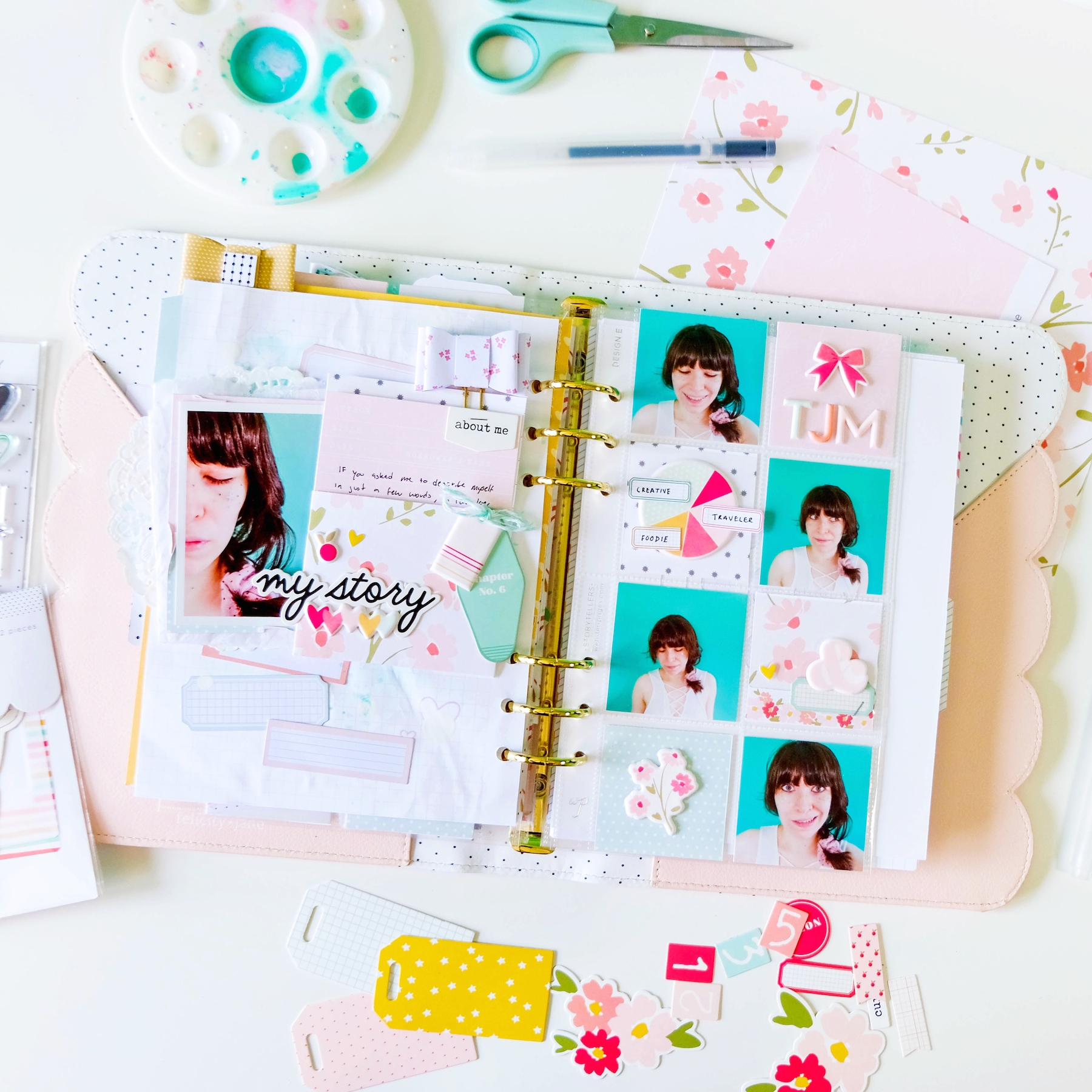
So I’ve got yet another 6×8 spread in my Felicity Jane Scalloped Blush Note to Self binder to share with you all today. Funny story this one. This was supposed to be my FJ blog project for next week but I quite stupidly ruined the layout by ripping the background page while trying to glue the backside of it onto the backside of the previous page in my planner. I was hoping you wouldn’t see it in the photos, but alas you do, so I scrapped it for my project and decided to just share it here. I can’t have that going up on the FJ blog! The perfectionist in me would not allow it!
So a different “Note to Self” binder spread will go up on Tuesday.
But I still wanted to share the process for this one. I used pieces exclusively from the lovely Katherine kit for this spread and documented some photos I took of myself for my creative self portrait project that I really to get working on. I paired a simple 6×8 layout with a pocket page, very similar to how I did my Lizzie McGuire spread.


For the layout, I did a bit of mixed media, which really compromised my paper in the end. I used some mint acrylic paint and my favorite white acrylic ink. I added a few of the Katherine label stickers that are an add-on this month, sort of cascading them down the page. Then I added my photo on top of it all. I created a fun library card pocket out of that beautiful floral paper from the kit and tucked one of the library cards into it to house my journaling. It’s not quite hidden journaling, as you can still see a bit of it, but it’s hidden enough for my liking. I layered the pocket on top of my photo cluster and embellished around the entire thing with a few die cuts and puffy stickers.


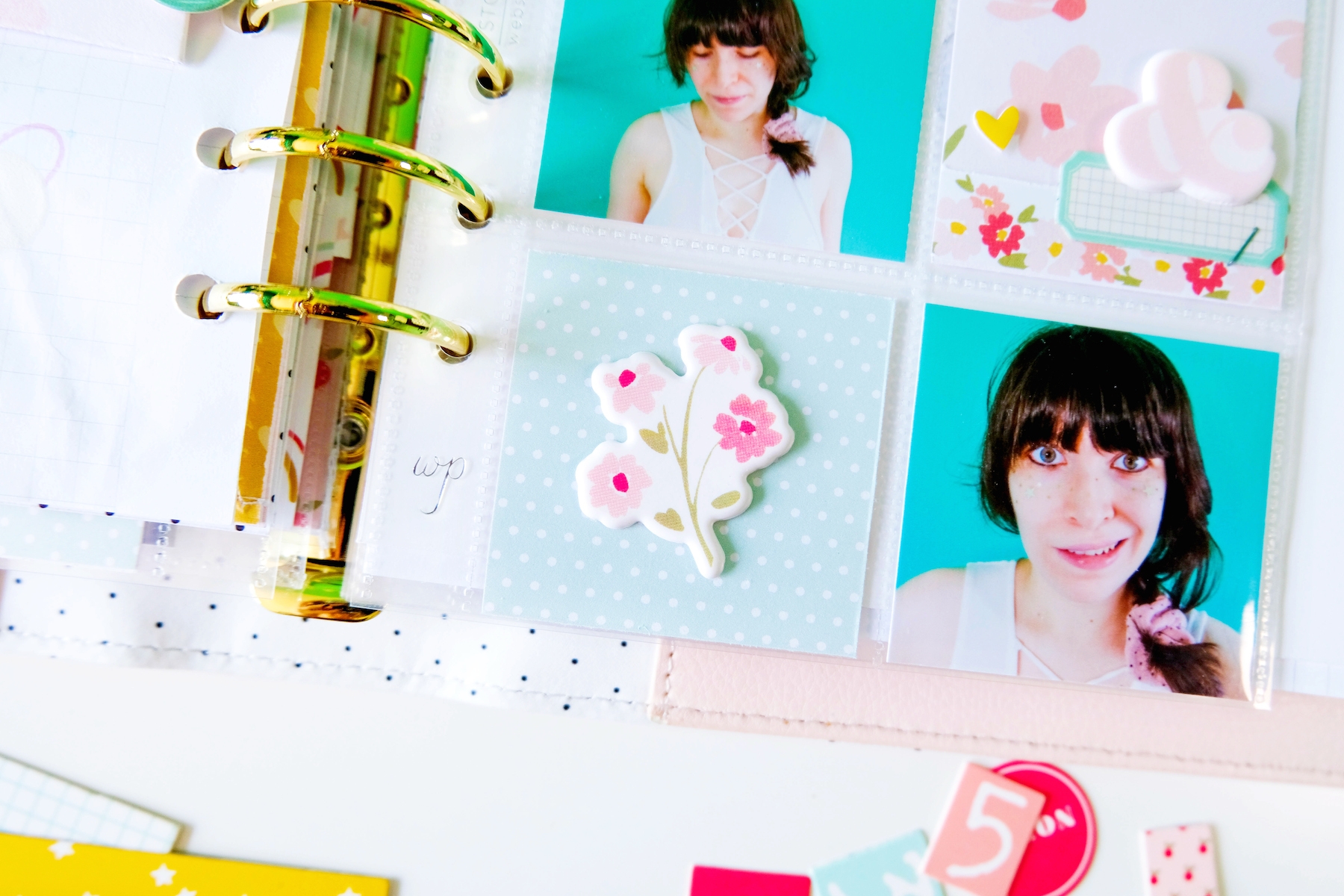
For the pockets, I tucked my favorite outtakes from my little photoshoot into the pockets. I filled the rest of the pockets with various pattern papers from the Katherine kit. To embellish these pockets, I literally used almost every puffy sticker from the kit. I love adding the stickers on top of the pockets in order to reduce the bulk within the pockets that cause the plastic to warp.
I had a bit of fun with that pie chart puffy sticker. I cut out the little labels from the Grace kit branding paper and matched one to each section of the pie chart. On the labels, I wrote done one word that I think best described myself. I ended up only labeling three of the sections as labeling all five looked too cluttered. I absolutely love how it looks though. Gives the pockets another dimension.
Anyway, I had fun putting this spread together. Below is the process video I was able to film showing you how both the pocket page and layout came together. I really hope you enjoy!