So I’ve decided to keep a monthly Project Life for this year. When I decided on this, I pulled out my ongoing 12×12 album and did a quick inventory of it. It’s not filled up at all. I literally create layouts and pocket pages for it when I feel like it, so nothing is chronological at all. What I notice that I’ve been is matching the pages so they end up looking like two page spreads rather than individual pages (even though I create them individually from each other). But I love the look of it; it keeps the entire album looking cohesive.
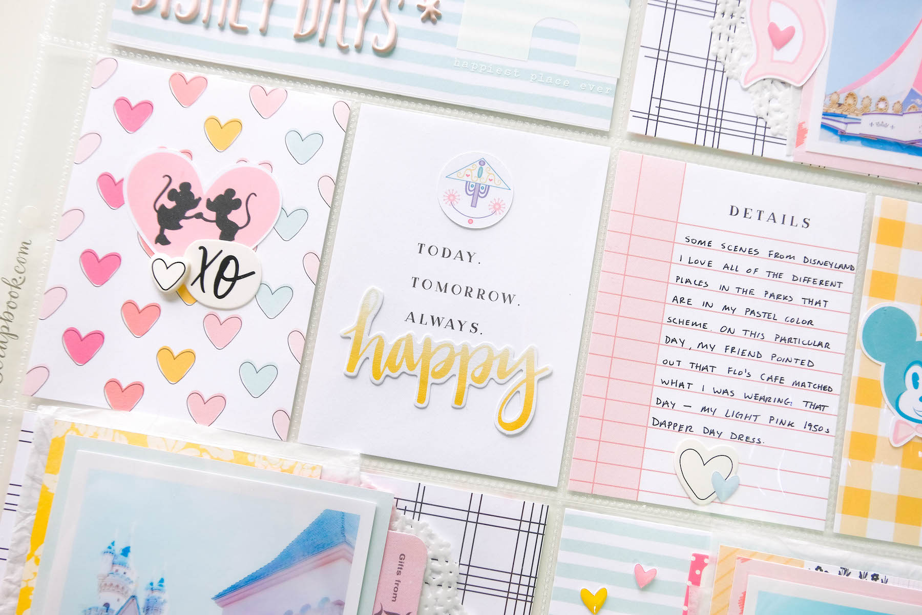
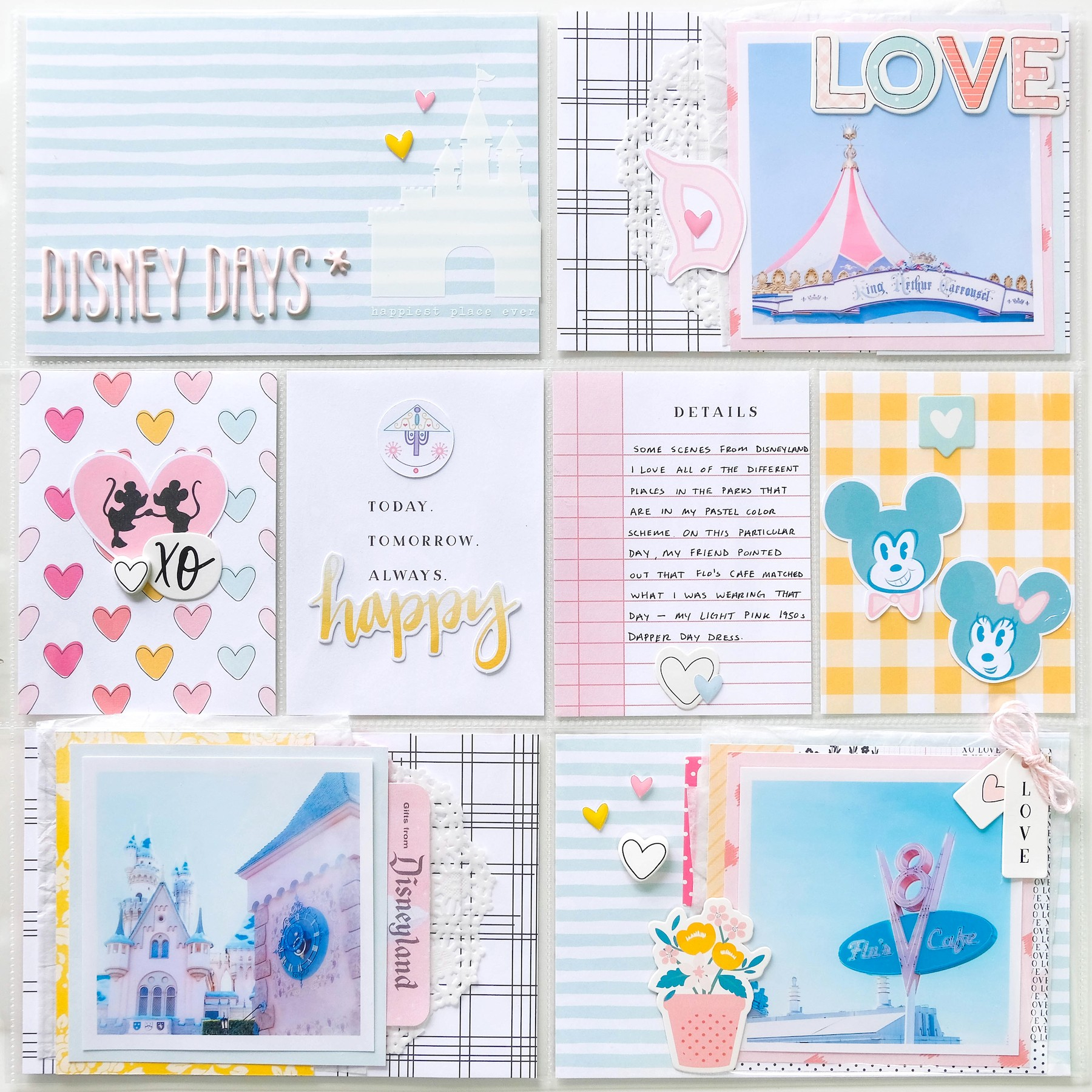
Anyway, I was looking through it and realized there were a few pages that need to be filled. They have photos in the pockets and everything, I just never got around to actually scrapping them. So I decided to create a pocket page for one of those unfinished pages, using the brand new Bailey kit from Felicity Jane. I thought the kit was perfect for this particular spread. The colors just matched perfectly with the colors I used in the corresponding layout that I made so time ago.
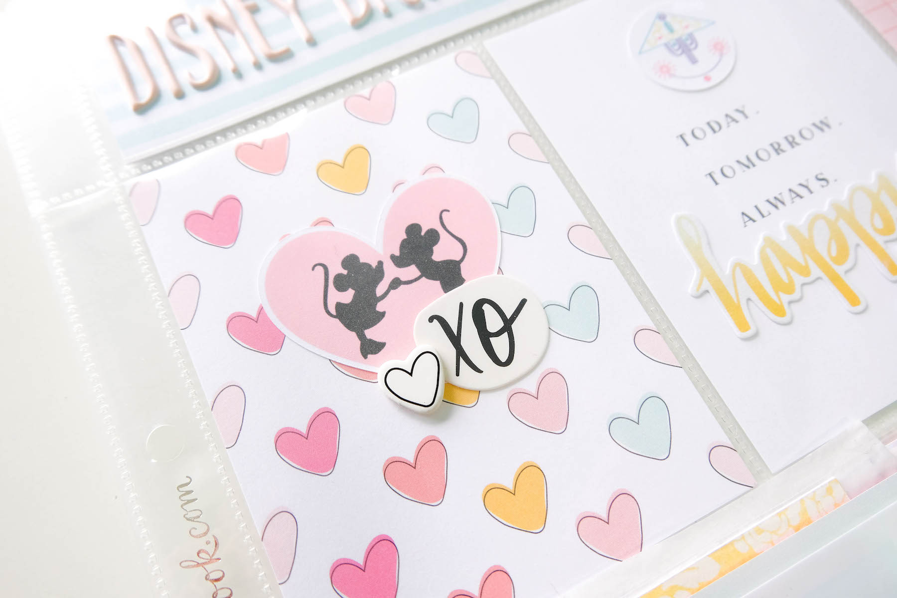
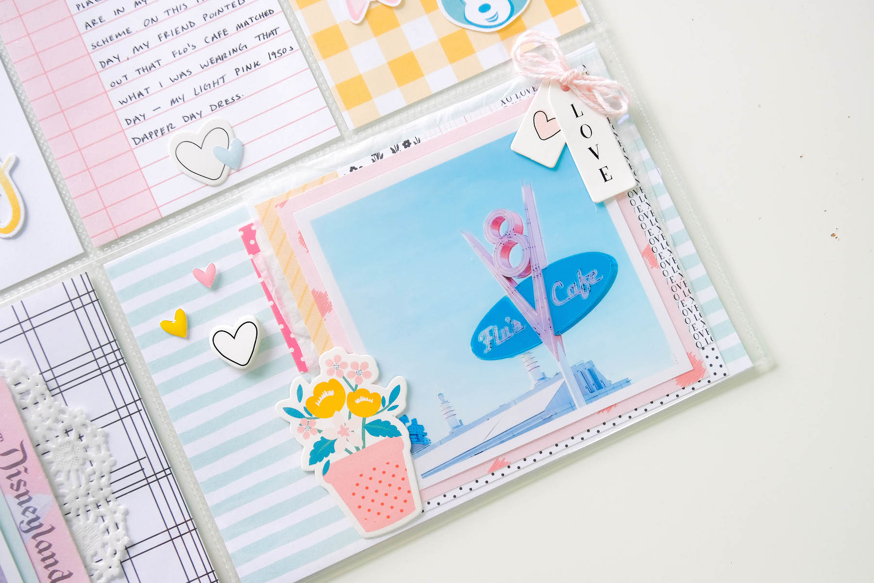
So I scrapped some photos I took at Disneyland when I went with my friend Keshia in 2018. They are just photos of different places in the park, like Flo’s Cafe and King Arthur’s Carousel. I already scrapped these in my Disneyland minibook, but it really wanted to create a pocket page with them in my 12×12 album. Plus, they are from the same trip that the corresponding layout photos are from. Everything goes well together.
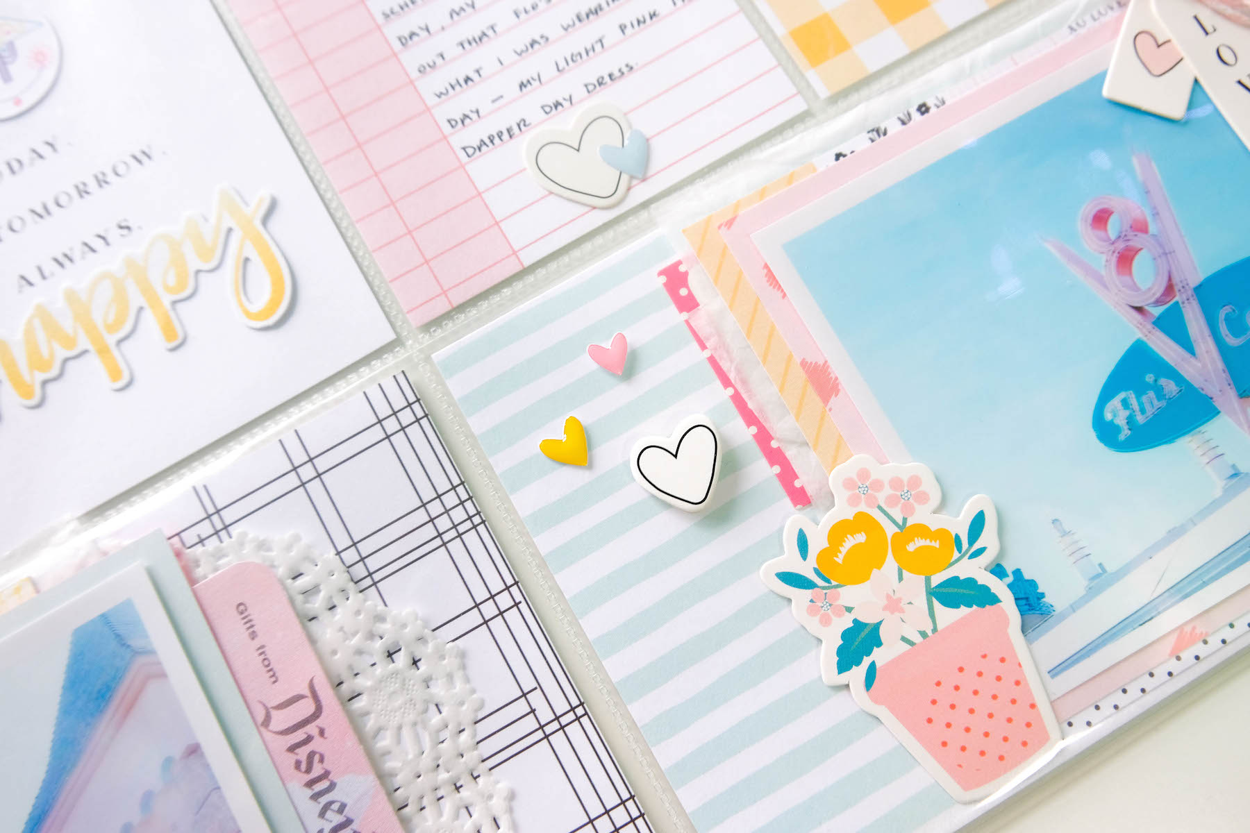
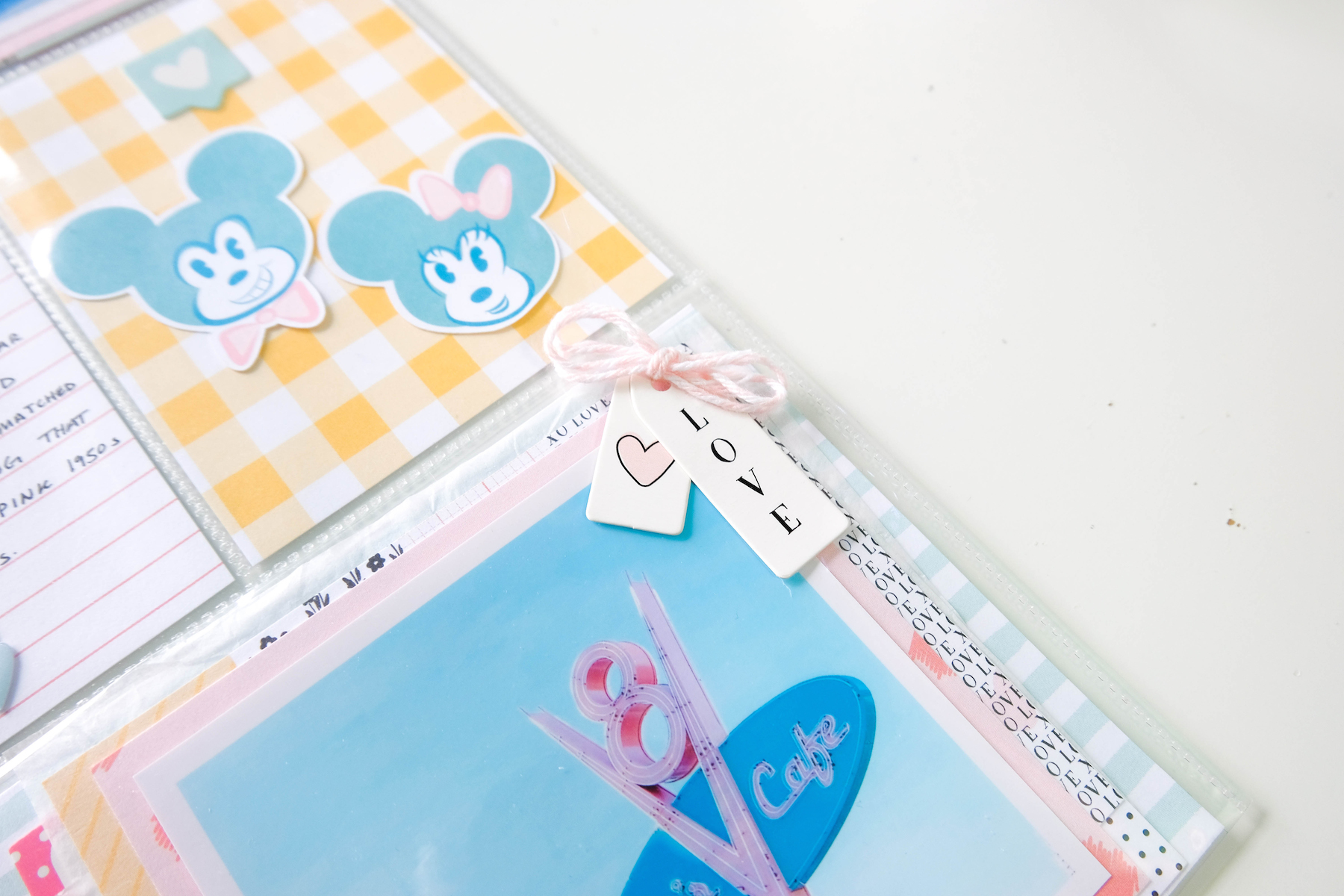
To compliment the Felicity Jane kit, I used some pieces from The Fairytale Club to add a bit more Disney to the page. I also used a transparency from one of the Simple Stories Say Cheese collections too. It’s one of the castle, which I put in a pocket of its own on top of a minty blue stripe pattern paper from the Bailey kit.
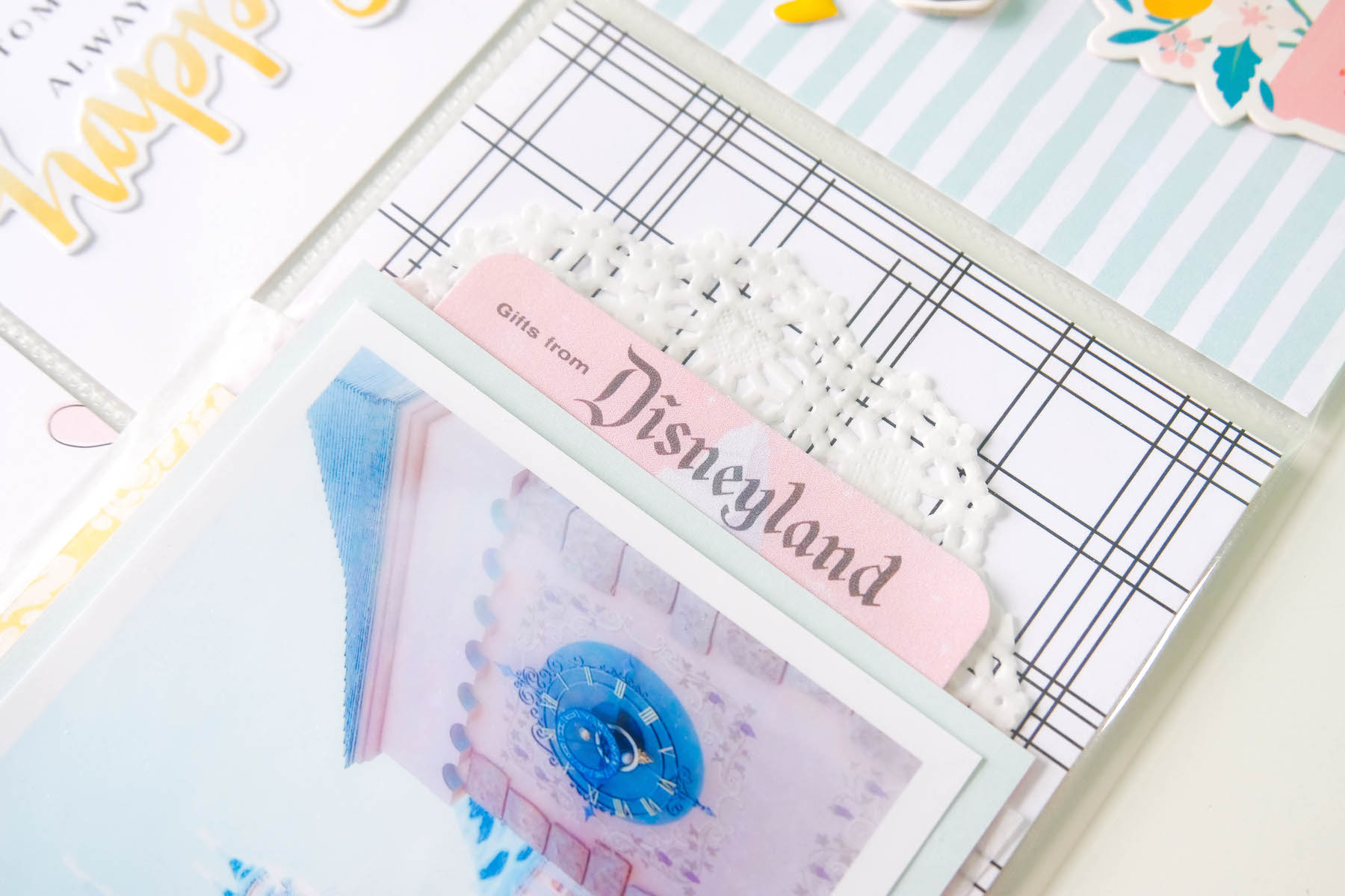
It took me a while to find the right papers for the 4×6 pockets. I knew which of the 3×4 journaling cards from the kit I wanted to use, but the 4×6 slots were a bit difficult. I was trying to match this pocket page to the layout as best as I could, but since the layout is so white, it was hard choosing the right papers. I settled on a black and white thin stripe plaid paper to compliment the minty blue stripe paper I ended up using behind the transparency.
I embellished the pockets lightly with a few dimensional bits from the kit. The bulkier pieces I placed on the outside of the pockets, a little trick I like to do when incorporating these bulky bits on my pocket pages. And that’s it!
I really hope you enjoy this process! While I was very indecisive during the process, I’m actually very happy with how it turned out!
