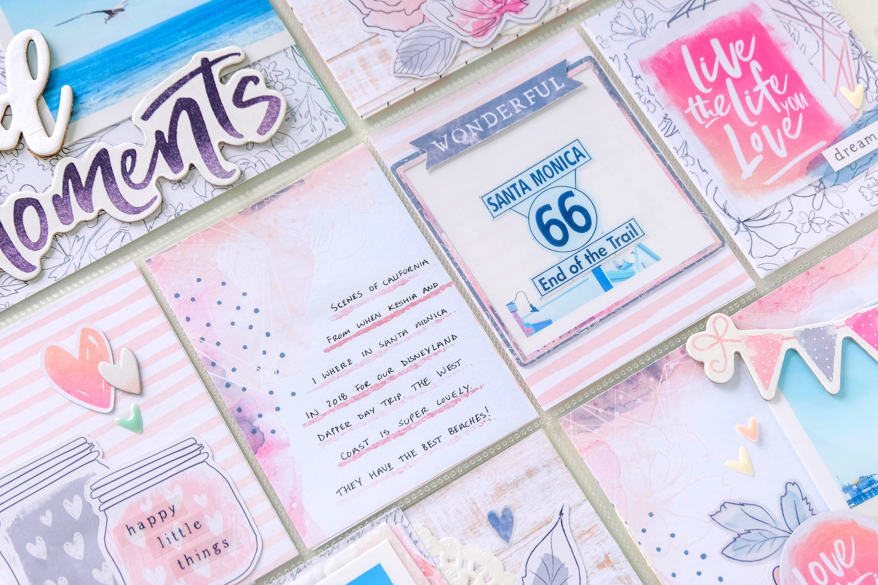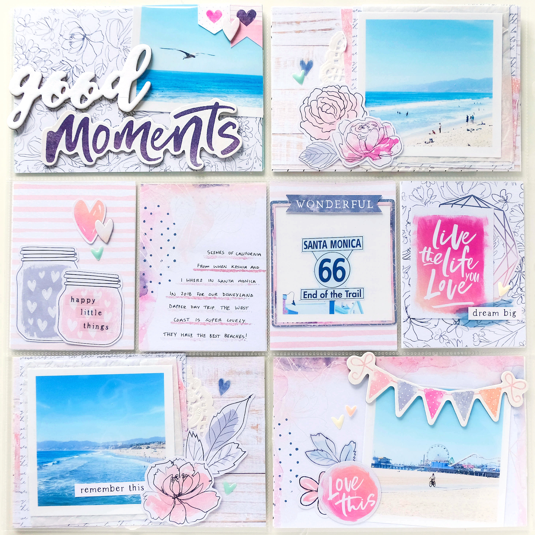
I have another pocket page layout to share with you today. I created this page documenting some beach photos from my California trip. The photos were already in the pockets next to a Disneyland layout I had already done, so I matched them up using the Cocoa Vanilla Studio Midnight collection.


This pocket page layout took a while to come together. I struggled with finding the best papers from the collection to be the base cards. I wanted to find the best patterns that matched or complimented the papers I used in the corresponding layout. I actually ended up wiping my initial composition before finding the right patterns and embellishments that worked.


Most of the 3×4 cards in the center of my layout ended up being filler, except for one that I ended up stamping these brushed lines on for my journaling. I used my Brie stamp from Felicity Jane to create those lines. I find that my journaling looks better when I have some sort of line or grid to guide my writing. I generally hate my handwriting on layouts, so to have it sit straight on the page makes it look a lot better.


I honestly don’t have much else to say about this pocket page. Definitely check out the process video below. I explain what I did a lot better there.

I really hope you enjoy this process!