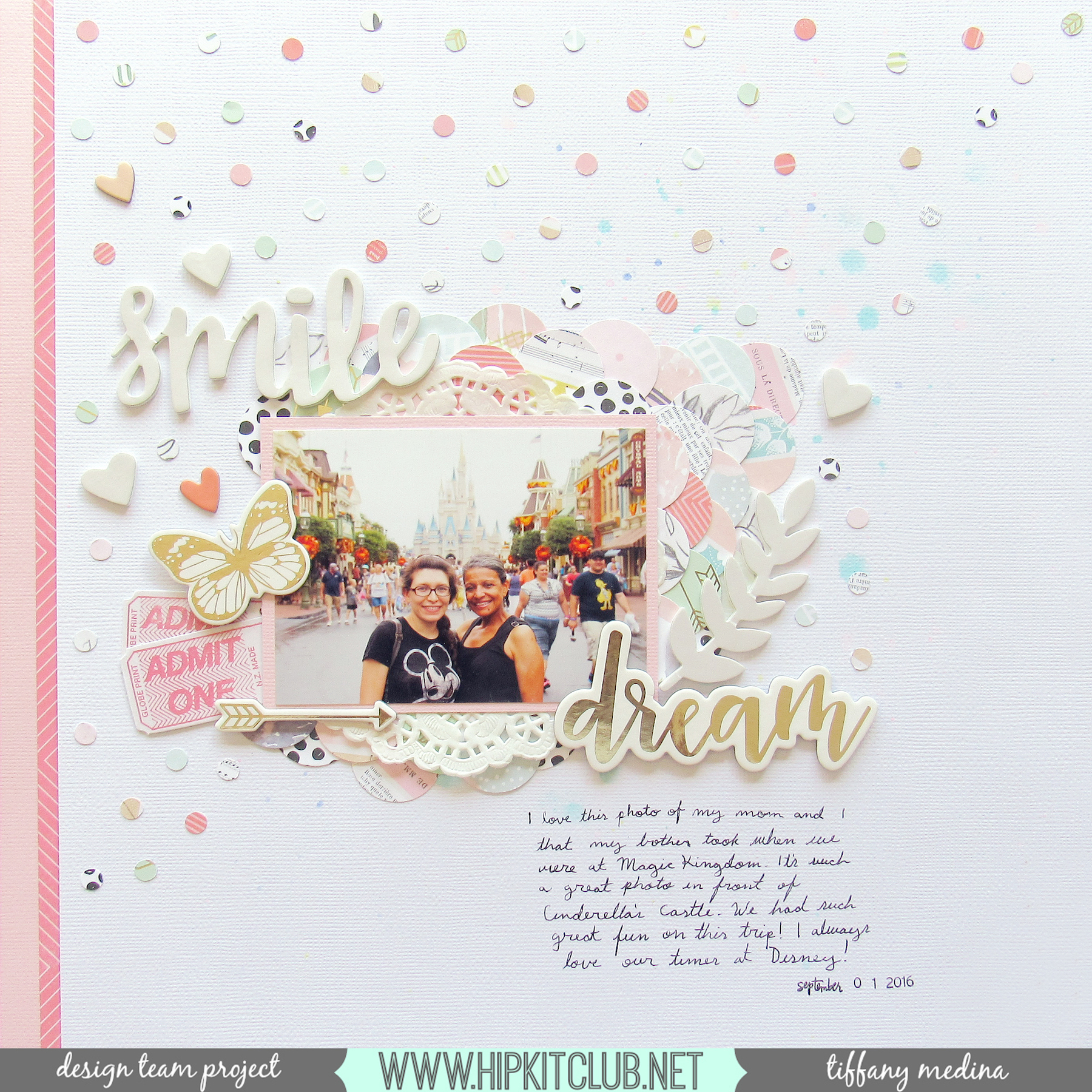
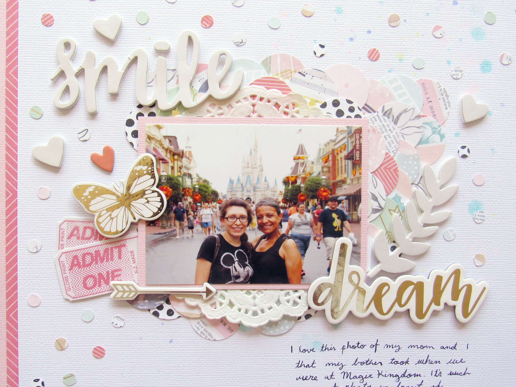
I’m back with another layout I did for Hip Kit Club. For this layout I used a photo my brother took of my mother and I standing in front of Cinderella’s Castle at Magic Kingdom in Disney World. My challenge for this layout was to maximize pattern papers, so I tried my hardest to use as many of the pattern papers from the kit on my layout as I could. What I ended up doing was taking a bunch of little scraps from some of the previous projects that I had left over from the kits and used a 1 inch circle punch to punch out a bunch of circles. I wanted to do a fun little background with them, but ended up layering them sort of like a mermaid fishtail scale coming out from behind my photo.
Before I did that though, I took my watercolors and added a few paint splatters all over the white cardstock, because I wanted a bit of pastel splatters to peek out from behind everything. I then matted my photo on the light pink cardstock and place it a bit off-center (to cover up some unwanted splatters on the page), which left me to build my scale so that it moved up and to the right, as if it were coming from behind my photo and fading out diagonally.
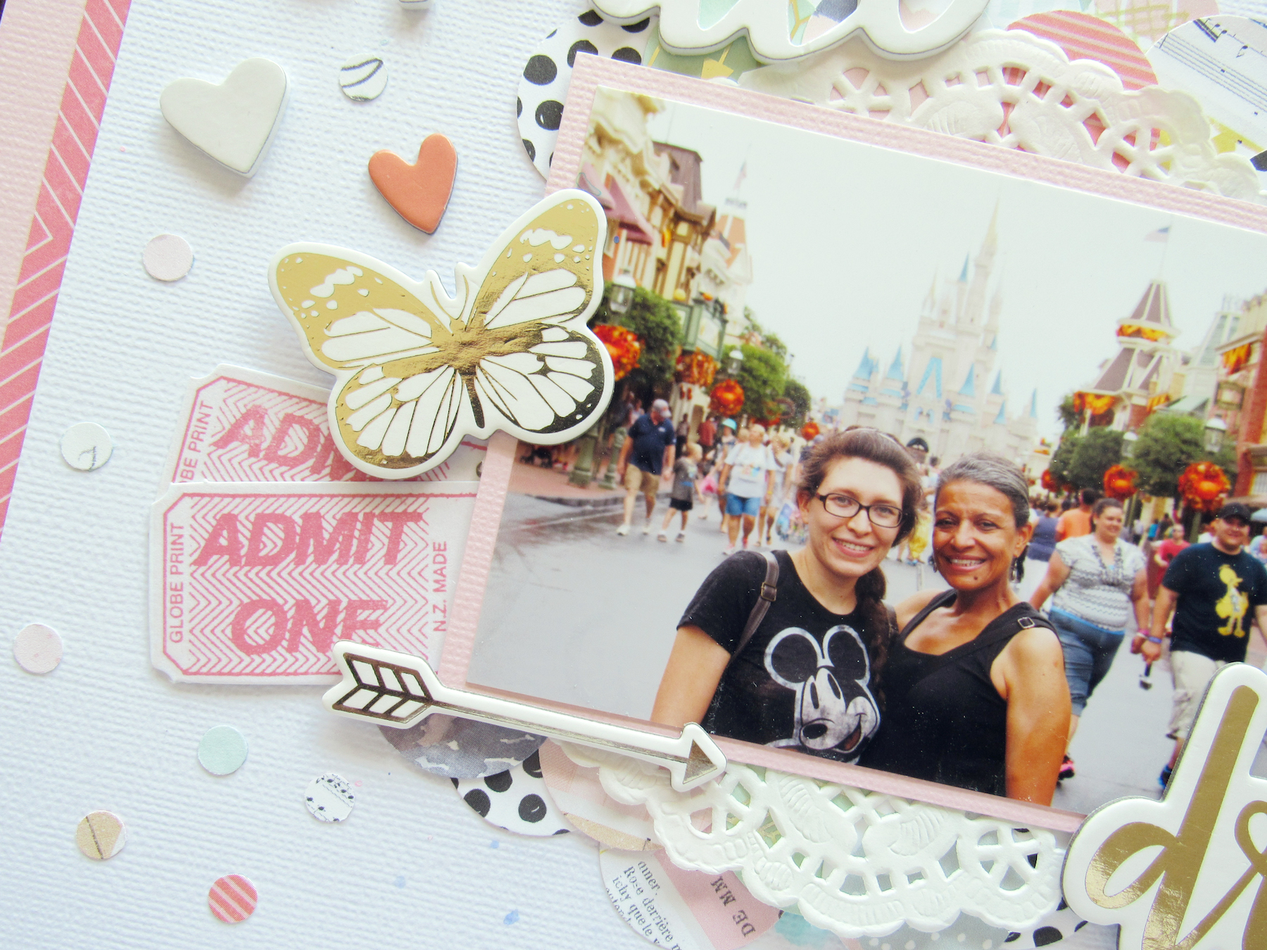
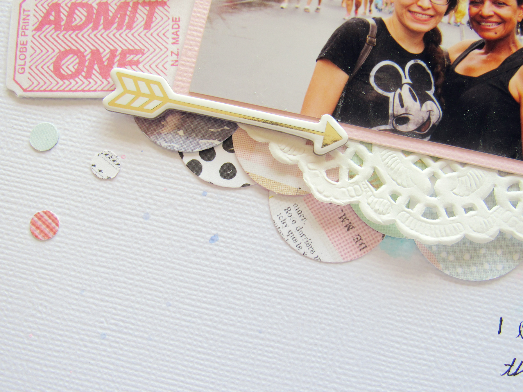
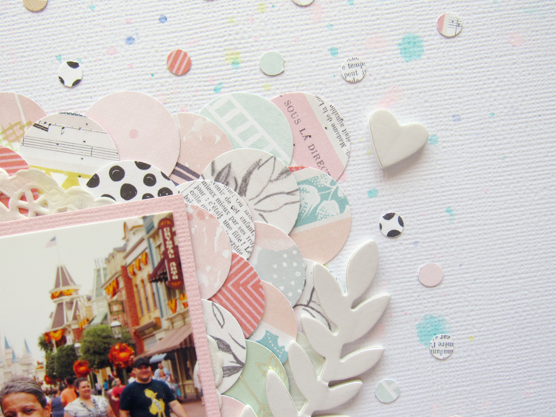
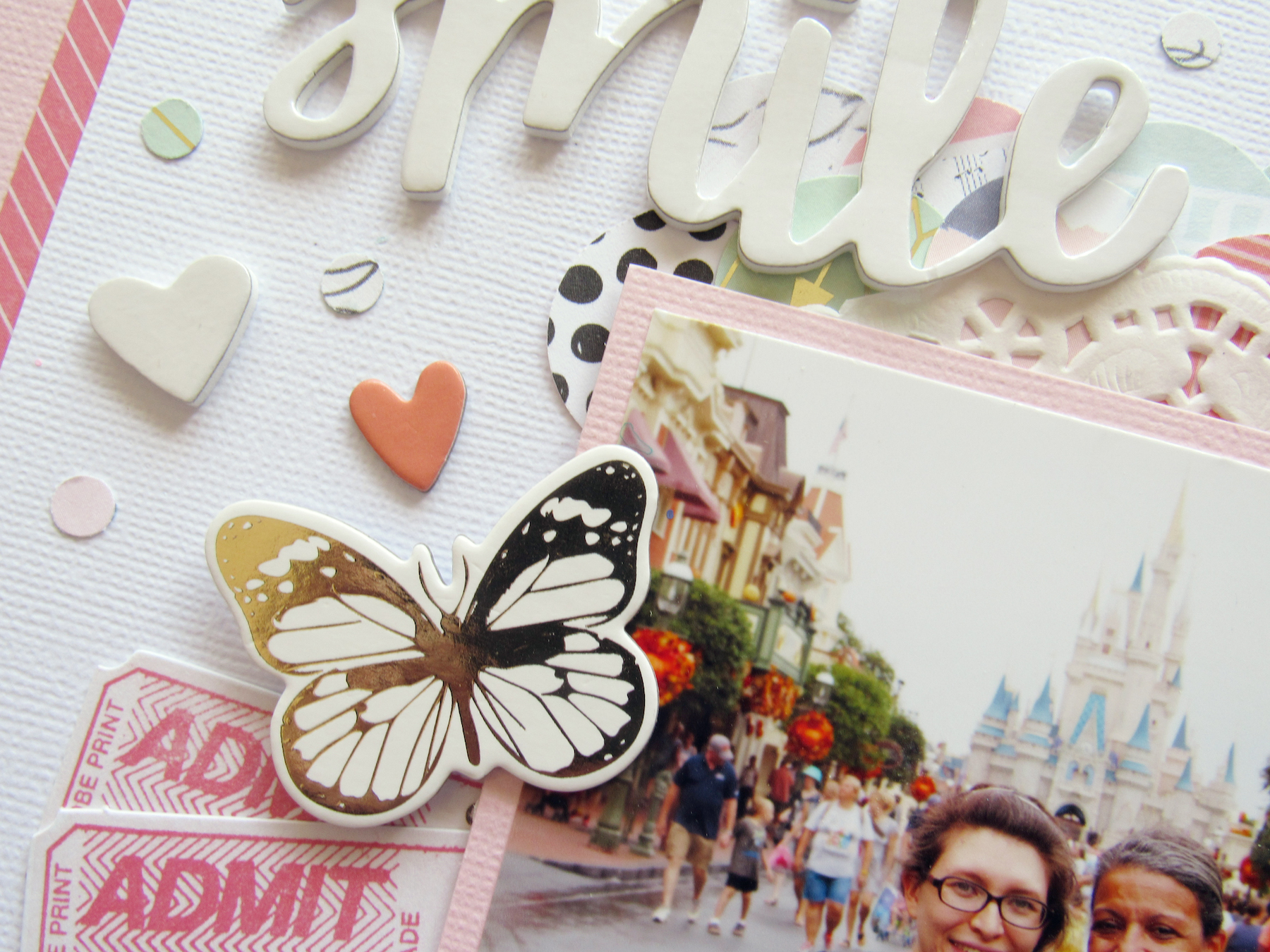
My layout basically grew out from there. I placed a white doily from my stash behind the photo, so that it poked out at the top and bottom. I also used one of those pearly white leaf thickers from the Paige Evans Take Me Away collection to sort of frame those circles on the right. On the left side, I used a ticket piece from the Dear Lizzy Saturday ephemera pack, cut it in two and stuck them behind the photo, so they peeked out. I then place the butterfly chipboard piece from the Simple Stories Posh line a little bit over them and the photo. I used an arrow piece from the same line to frame the photo on the bottom, then began to play around with my title.
I knew before I started this layout that I wanted to use the “dream” chipboard piece as part of the title. I played around with a bunch of the other phrase pieces from the kits before settling on “smile” and “dream.” I also messed around with the placing of them as well, before I settled on the “smile” being on the top left and the “dream” being on the bottom right. I then placed a few hearts on the page, a few from the Take Me Away thickers and two pink ones from the Posh chipboard.
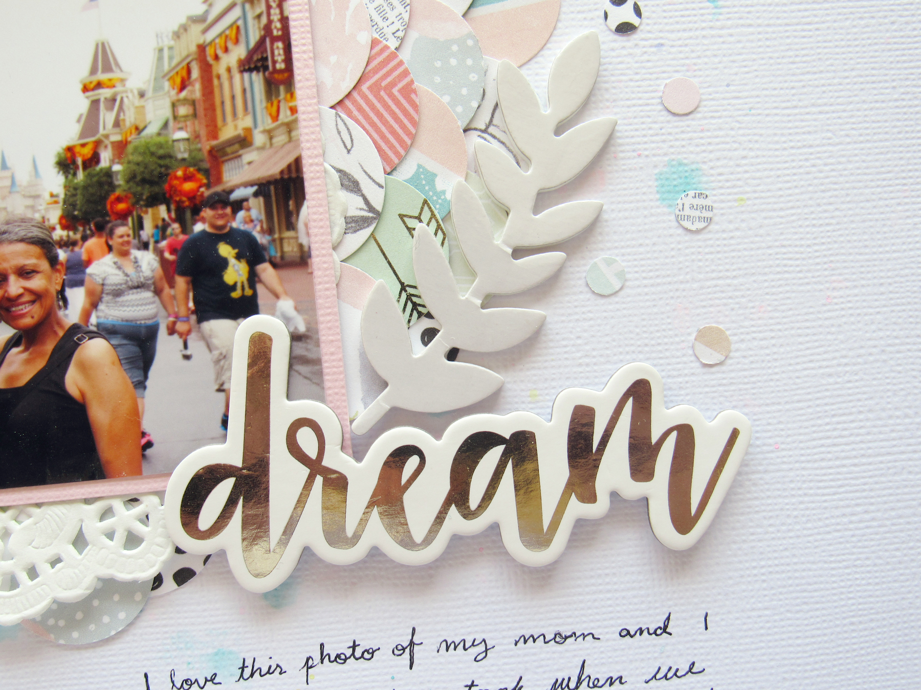
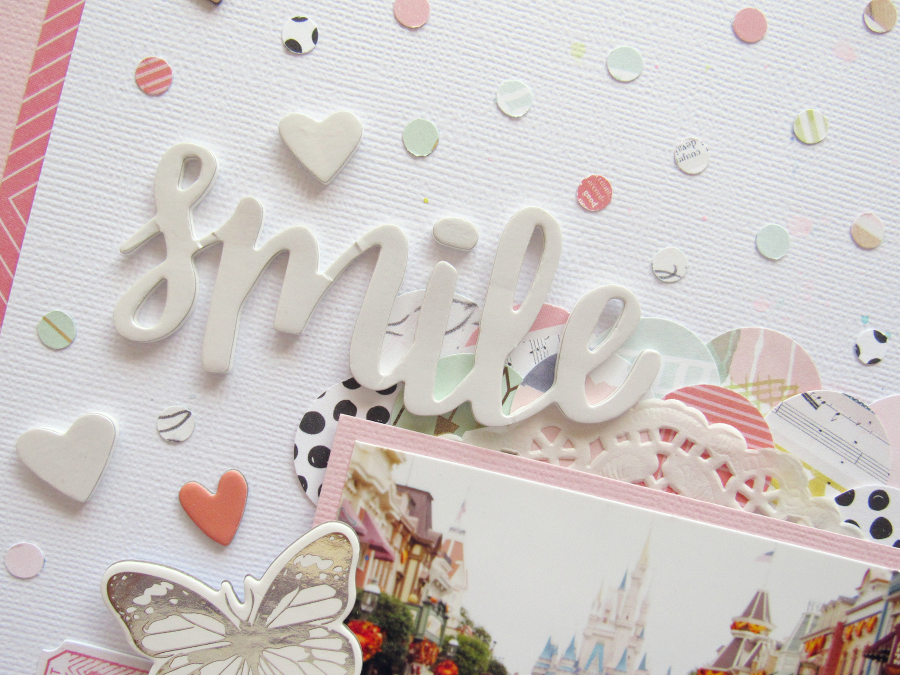
I still felt like my layout was a bit empty. Because I placed the photo off-centered, the whole layout seemed unbalanced. What I ended up doing was trimming a bit of the white cardstock from the right side and adding two strips of paper to the left. I used the light pink cardstock and a darker pink paper, layering them on top of each other to make it a bit more interesting trim. Yet, I still felt like the layout was missing something, especially with all the white space on the top. So I took my hole punch–just one of those regular hole punches that I use to punch the holes to stick things into my planners–and punched out these little confetti circle pieces from all the pattern papers, so that I could sprinkle them about the page. I ended up covering the top half of the page with these little circles and leaving the bottom right side white. Under the “dream” I did my journaling and that’s it. Be sure to check out my process in the video down below and I hope you enjoy!
Products used: Hip Kit Club October 2016 Main Kit, October 2016 Embellishment Kit Add-on + October 2016 Cardstock Kit Add-on
