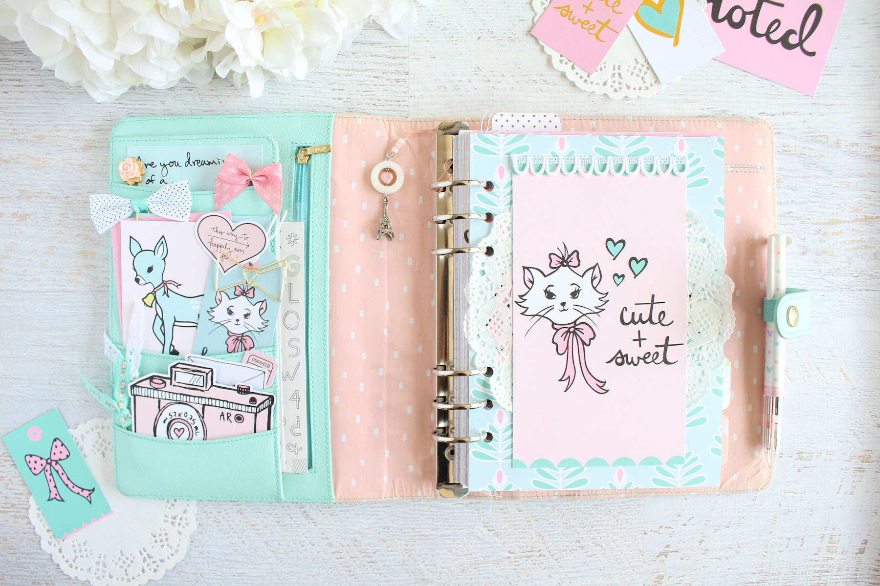
I’m here today with a planner setup in my A5 mint Kikki K planner using the “Take Note” kit from The Fairytale Club. I absolutely love the colors of this kit and when looking through my planner, I decided to switch the binder to this lovely Kikki K because it matched so perfectly!
So the very first thing I did was pull out all the light pastel bits from the kits that I really liked. It wasn’t very hard as most of the kit are these beautiful light shades of pink and mint. But I knew that I wanted my focus to be on the Marie-inspired dashboard included in the planner kit. I absolutely love Andrea’s illustration. It’s definitely so cute and sweet just like the dashboard says! So I pulled out bits from the ephemera pack that matched. I even cut a few things out of the cut apart sheet to include as well. Then I chose my papers.
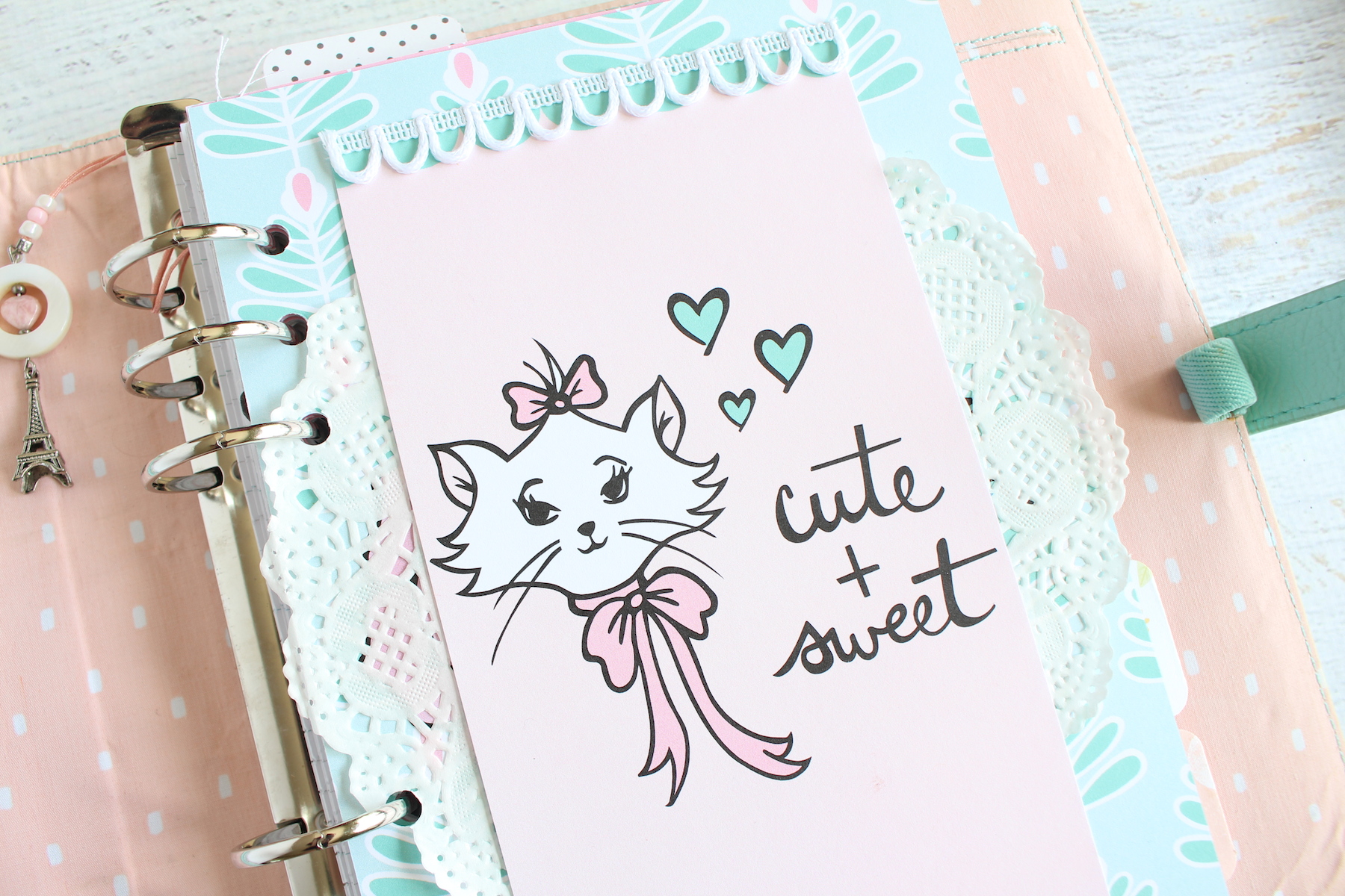
So for the main dashboard, I used two dashboards. I used the Marie one from the personal planner set and then the Giselle paper dashboard from the A5 set. I really love that Giselle paper but didn’t want to cut into my 12×12 sheet for this project, so I just used the A5 dashboard that had the same print on it. All I did was cover up the watercolor flower with a white paper doily, then layered the Marie dashboard on top. I added a bit of this scalloped lace trim I had in my stash to the scallop part of the dashboard on top, just to add a bit more texture to balance out the paper doily.
For my planner pockets, I decorated them with a few bits from the ephemera pack that complimented my dashboard. I used the Marie tag in mint layered over the mint Bambi card from the cut apart sheet in the main pocket. I embellished that little cluster with some bow paperclips from my stash and that heart die cut that reads “This way to happily ever after” because it’s just so freaking cute! I tried my best to balance out the mints and pinks against the darker mint color of my planner.
In the bottom pocket, I added the pink camera that I fussy cut from the cut apart sheet and tucked the little white letter and one of the pink ticket stub die cuts behind it, along with a few ribbon paperclips. In my top pocket, I have two more paperclips and the card from the cut apart sheet that says “Are you dreaming of a…” which I have just sticking out at the top. I kept my pockets pretty simple, but still really cute.
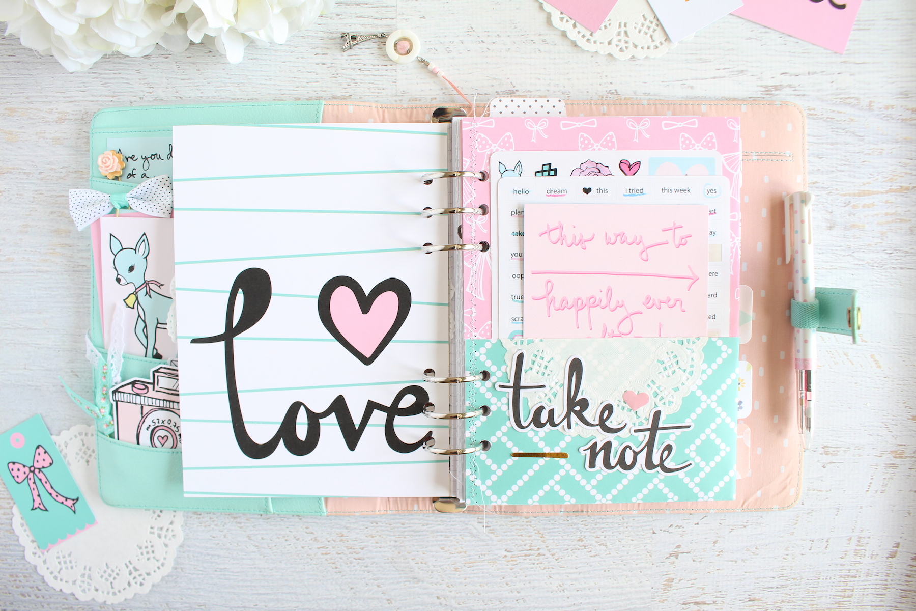
I left the back of the dashboard alone. I loved the design too much to alter it in any way. But instead of going straight into my inserts, I decided to make a pocket from one of the 12×12 sheets of paper. I chose this paper with the white bows on pink and the lovely mint green dot pattern on the back. A 12×12 sheet of paper makes the most perfect A5 planner pocket with absolutely no cutting involved. All I did was measured it against one of the A5 dashboard and folded over the bottom to create my pocket flap. Then I folded the entire thing in half, stitched the opened side and punched it into my planner.
I ended up embellishing both pockets with a white paper doily. Again, I just love the added texture doilies give to my planner. On the front pocket, I used the “Take Note” die cuts, a pink epoxy sticker and this random stray gold foiled bit from my ephemera pack to decorated the pocket. In this particular pocket, I have the stickers from the kit along with this card from one of the cut apart sheets that says “This way to happily ever after” because I absolutely love it!
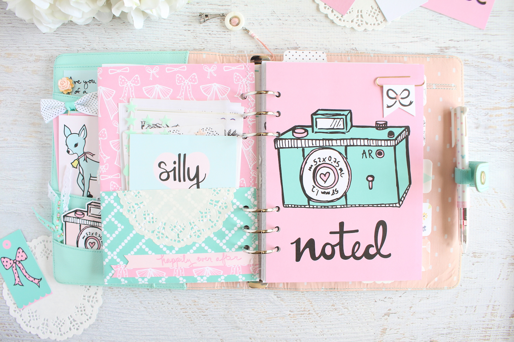
On the back pocket, I decorated the bottom with two of the branding strips layered on top. I had actually gotten a mark on my paper as I was creating the pocket that I wanted to cover up, so I just made the two strips into banners on the end; the perfect cover up! I left the pocket really simple and in it I have more stickers from my stash, along with this card from the May Girly & Strong kit that reads “silly,” because the colors just matched perfectly!
Opposite my pocket, I punched in the camera dashboard because it complimented the colors of the pocket so well. I also really love this camera illustration. To embellish it, I made a banner paperclip from a black and white bow paper from the Girly & Strong kit. I absolutely love how Andrea’s kits compliment each other. It makes it so easy to mix n match bits from each kit in your projects! I embellished the center of the bow with a pink enamel dot from my stash and have the paperclip clipped so that when I turn the page, it turns to my current spread.
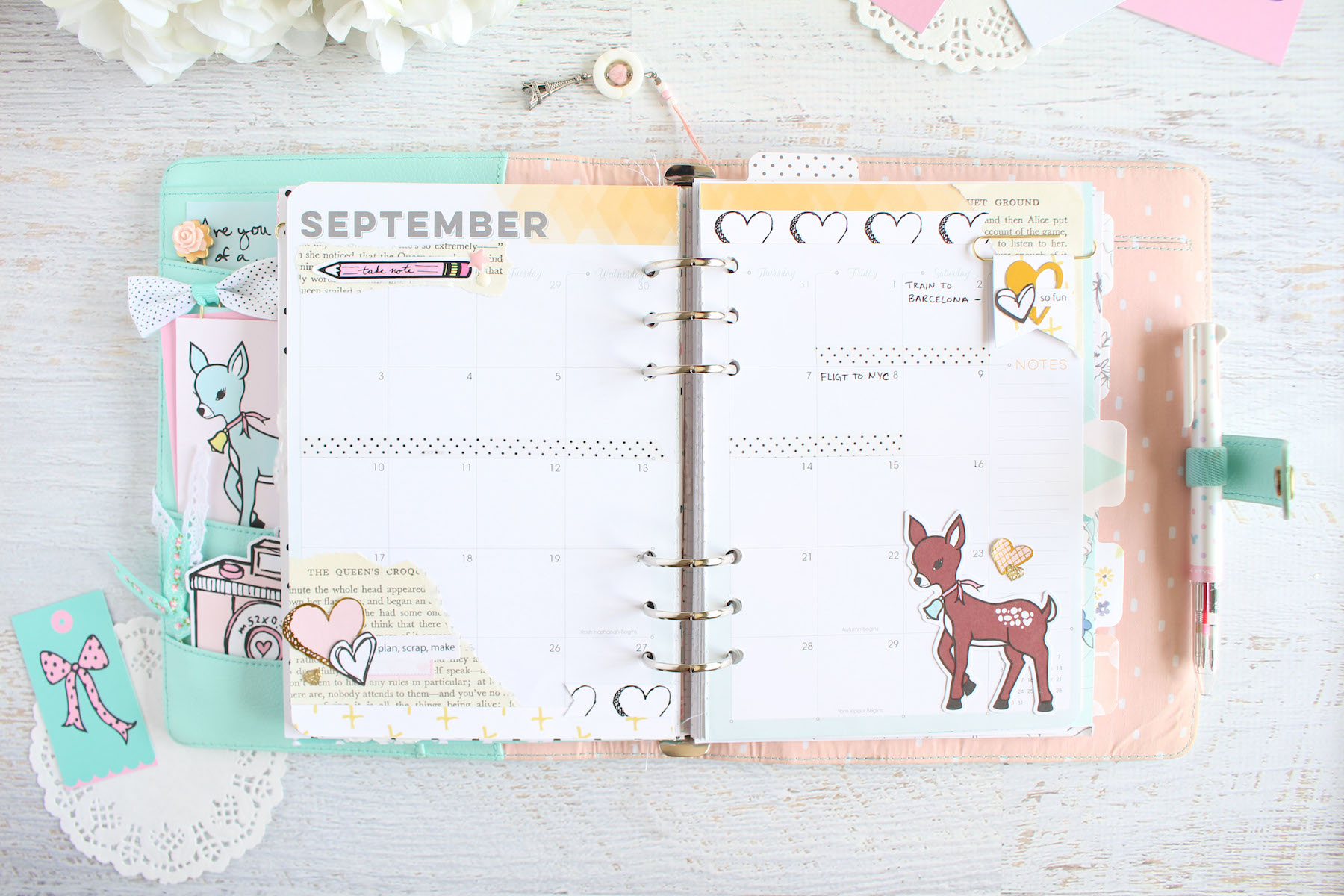
For my September monthly spread, I struggled a bit with decorating it with bits from the kit. I’m using these Inkwell Press planner inserts that have a certain color for each month, and this month it’s this golden yellow color, which is nowhere in this month’s kit. So I pulled out a few branding strips. I swear by the branding strips! They are always so useful, so I never throw them out. Here, I used the sketched black and white hearts from the kit and this yellow cross pattern strip from the Girly & Strong kit because I needed that yellow to repeat somewhere and it matched so perfectly. I embellished the top and bottom of my inserts with the strips, again cutting them into banners.
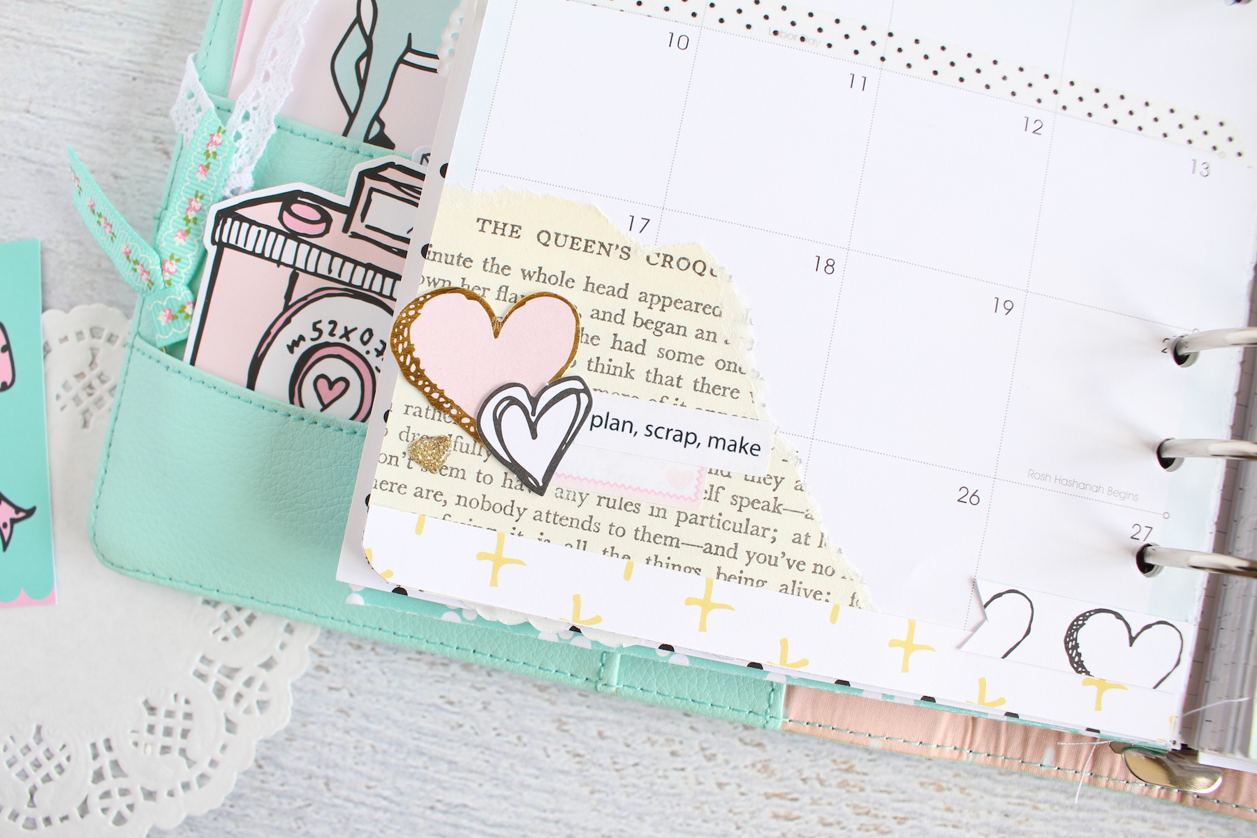
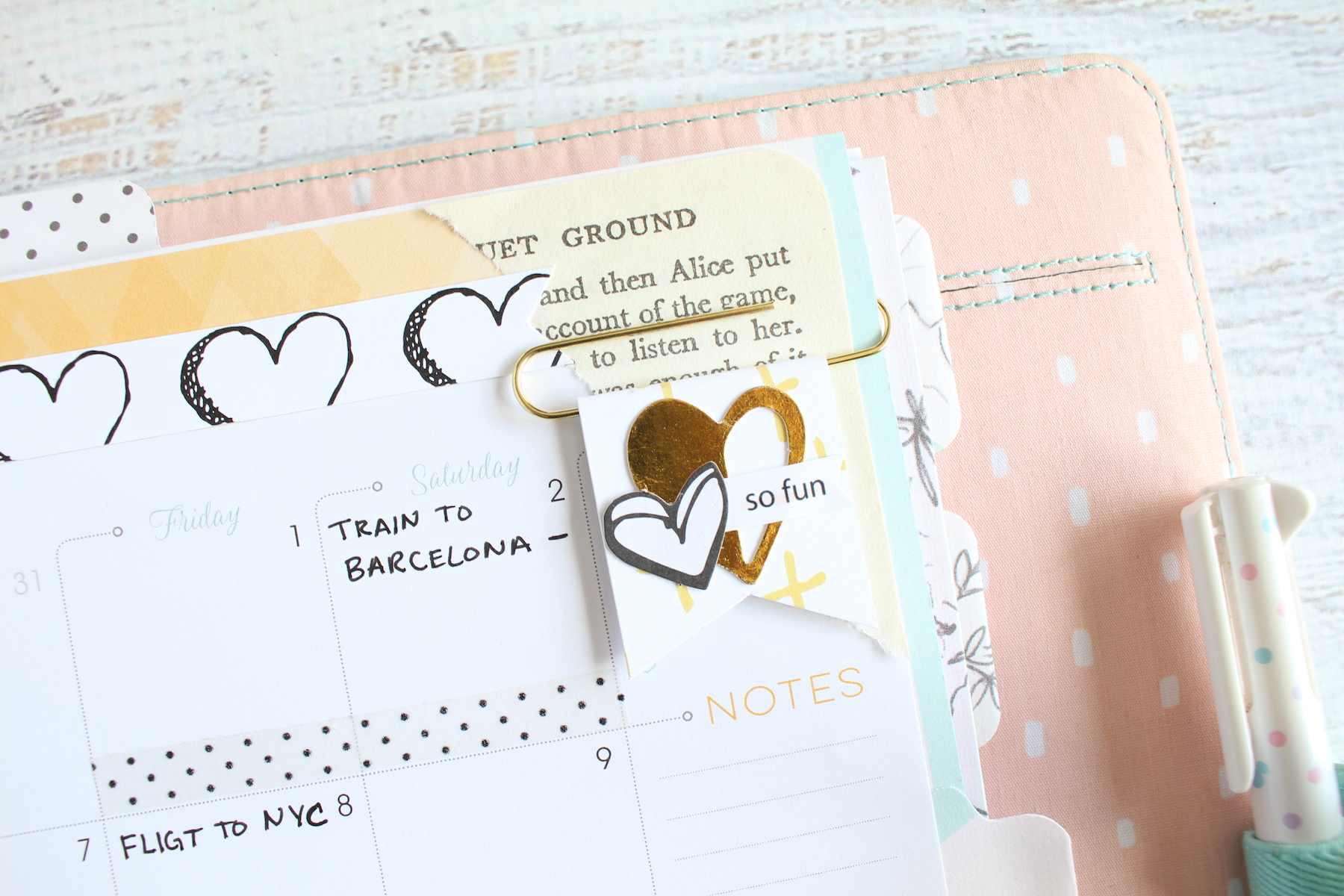
I then took a sheet from an Alice in Wonderland book and added a few ripped pages to the corners of my spread. It added another texture to my spread as well as added more warmth to my page. On the bottom left cluster, I layered a few heart die cuts with a few of the stickers from the kit, just to give the corner some more interest. The little gold glitter enamel hearts are from a Crate Paper line I had in my stash. I thought they matched perfectly. On the top right, I made another one of those banner paperclips using the yellow cross paper from Girly & Strong and embellished it with more heart die cuts from the Take Note kit as well as one of the word stickers that says “so fun.”
I decided to include the little brown Bambi deer to the bottom right corner of my monthly spread because it was just too cute and it really complimented the warm tones in this spread. I embellished it with some more hearts. On the top left, I repeated the ripped book page and layered a Take Note pencil sticker over it with a few enamel dots to match. I kept my monthly quite simple so that I have enough room to write down all of my plans. The polkadot washi tape in the middle is marking off a trip I was on since August, so that’s why it’s there. But I really love how it still matches everything else on the spread. That black and white heart pattern on the branding strip at the top really helps balance the colors and patterns out nicely.
I really hope you enjoyed this planner setup! I’ve included a walk through of my entire setup below so you can get a better peek at how I used the Take Note kit in my planner!

