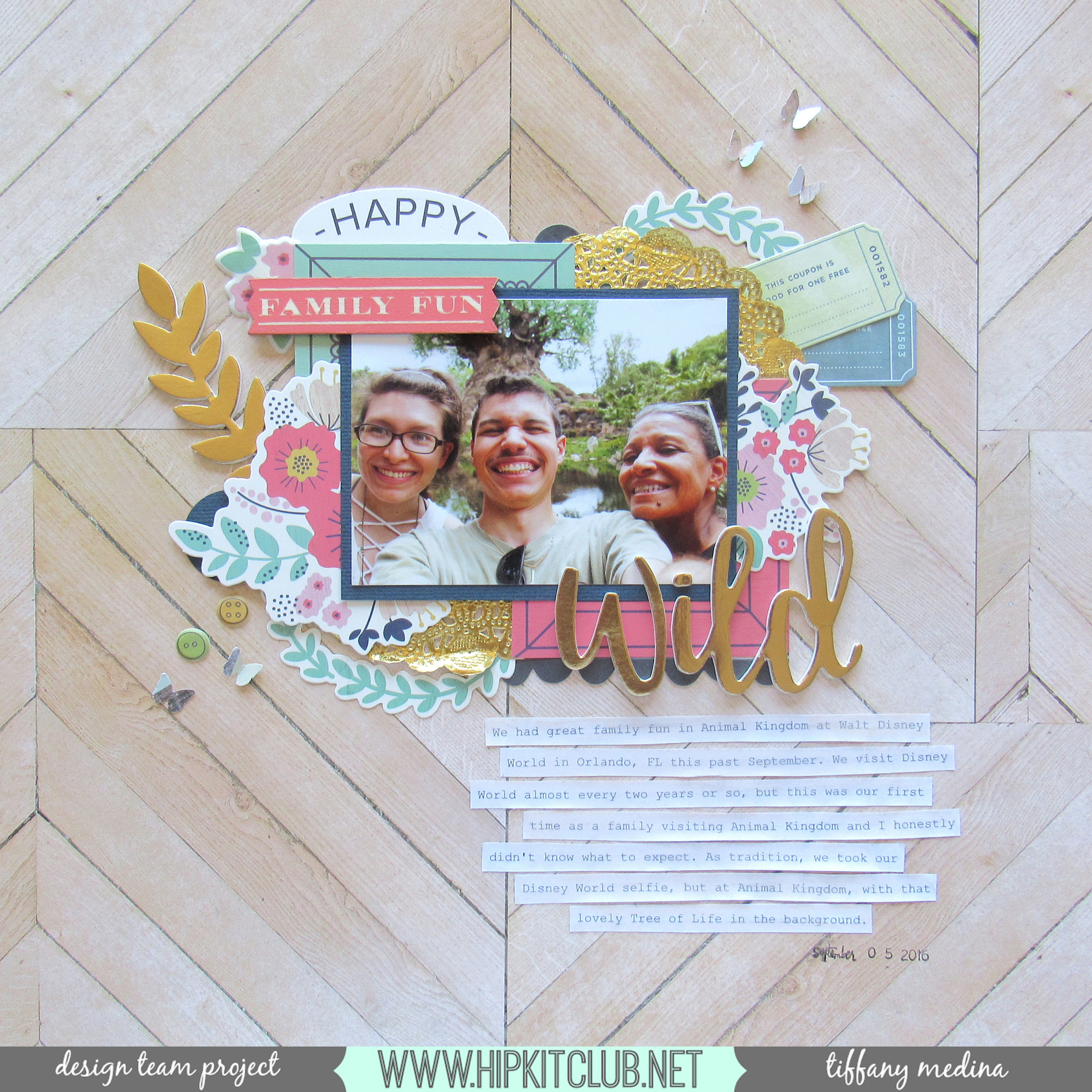
Can I just start off by saying how much I love how this layout turned out? I am quite proud of it, actually. This layout was a bunch of firsts for me. For one, the challenge was to use “No White” as in the bright white cardstock that I love to use as a background. Two, it’s my first attempt at doing a 12×12 layout as I’ve only ever done 8×8 layouts before. And three, I had to use the theme of “Gratitude or Family” and well, I had this awesome selfie my brother took of he, my mother and I at Animal Kingdom in Disney World this past September, with the lovely Tree of Life in the blurry background behind us. My family and I try to make it to Disney at least twice a year, a tradition we began after my dad past away in 2012. It began as a way for us to get away and just enjoy ourselves and well, we enjoyed ourselves way too much cause we always go back. And with the tradition, we always take a family selfie at Disney. This year’s just happen to be at Animal Kingdom and it’s wonderful.
So naturally when I saw that woodgrain pattern paper, I knew it would pair perfectly with our selfie, and since I couldn’t use white, I decided to accept the challenge! Another challenge that I imposed upon myself was to use up as much of the embellishments from the Main kit and Embellishment kit as I could. I’ve been having a really hard time using up those pieces in my projects because they aren’t pieces that I’d normally gravitate towards, so adding that on top of the no white challenge really pushed me far outside my comfort zone, but I rather enjoyed it!
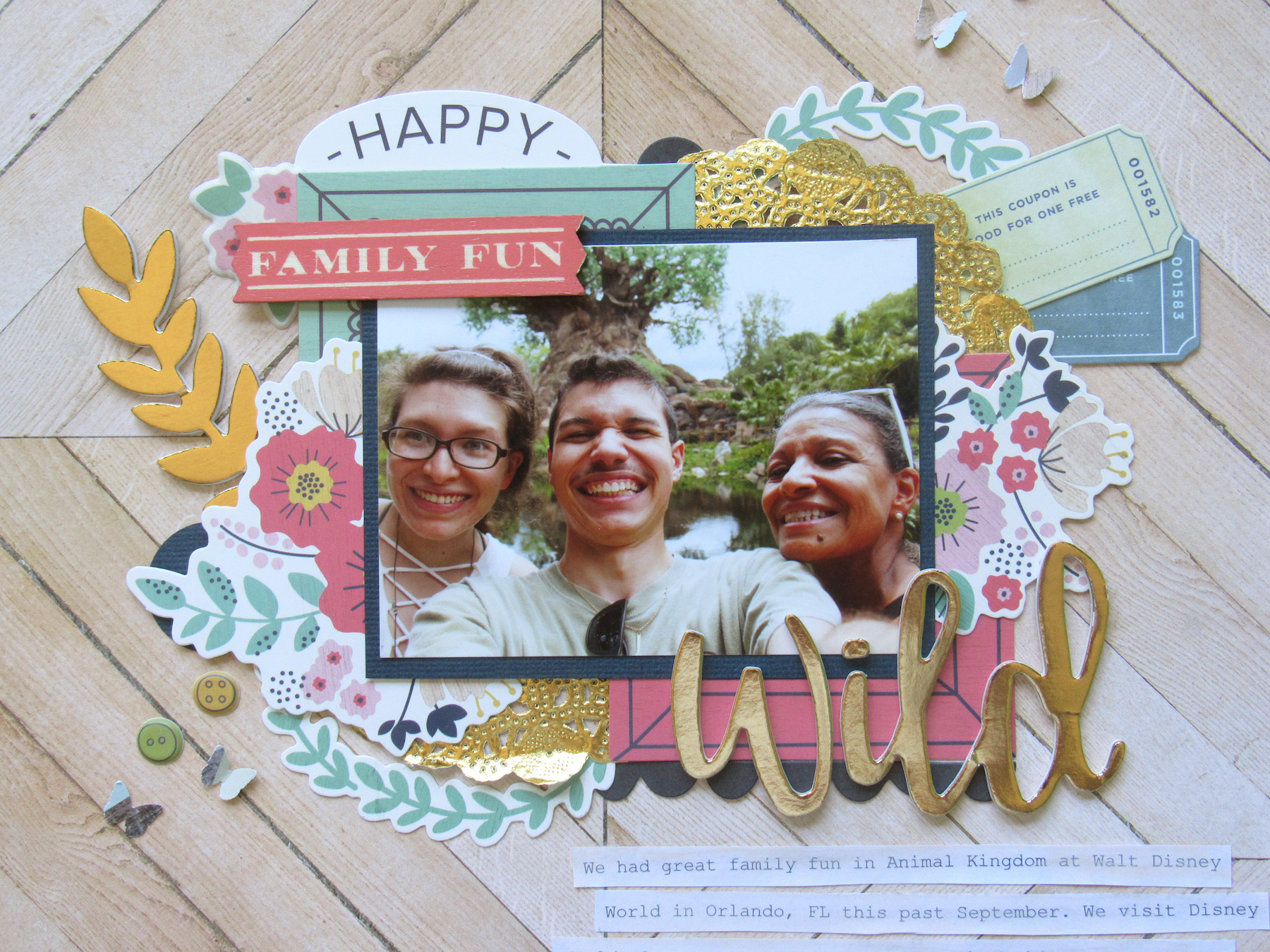
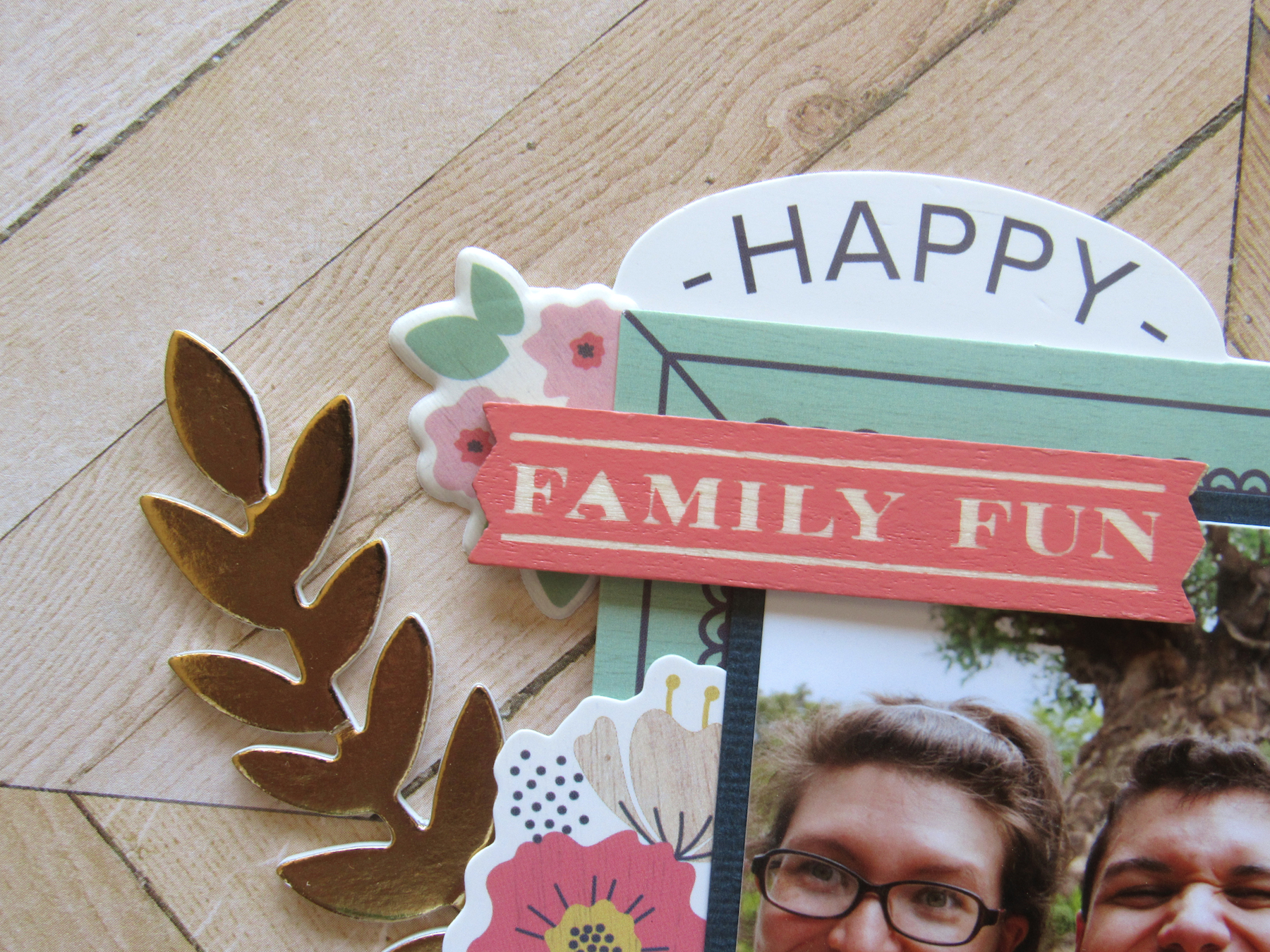
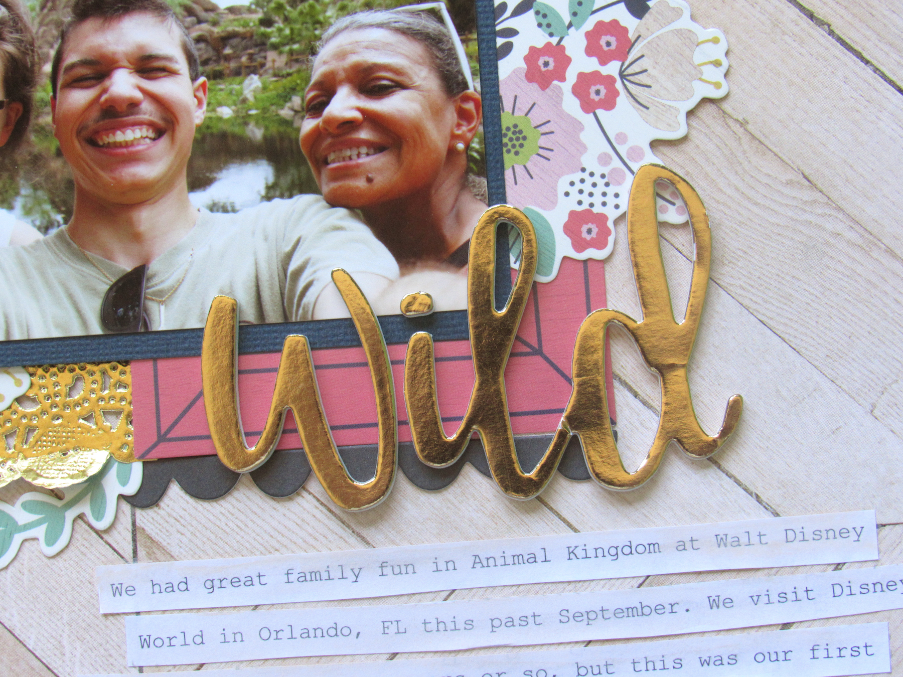
First thing I did was find a placement for the photo. I had already pulled out two frames from the WRMK Honey I’m Home ephemera pack along with these gold doilies I had in my stash that I knew I wanted to use, and just started layering them behind the photo. Since I placed the photo in the center, I knew I wanted to make a cluster of embellishments sprouting out from behind it. I played around with a few pieces I pulled from the ephemera packs and just layered. I knew for a fact that I wanted to use the “Family Fun” wood veneer from the WRMK Honey I’m Home wood veneer pack and the gold foiled “Wild” thicker from Pink Paislee’s Take Me Away on this layout, I just had to build up the background in order to make them work on the foreground.
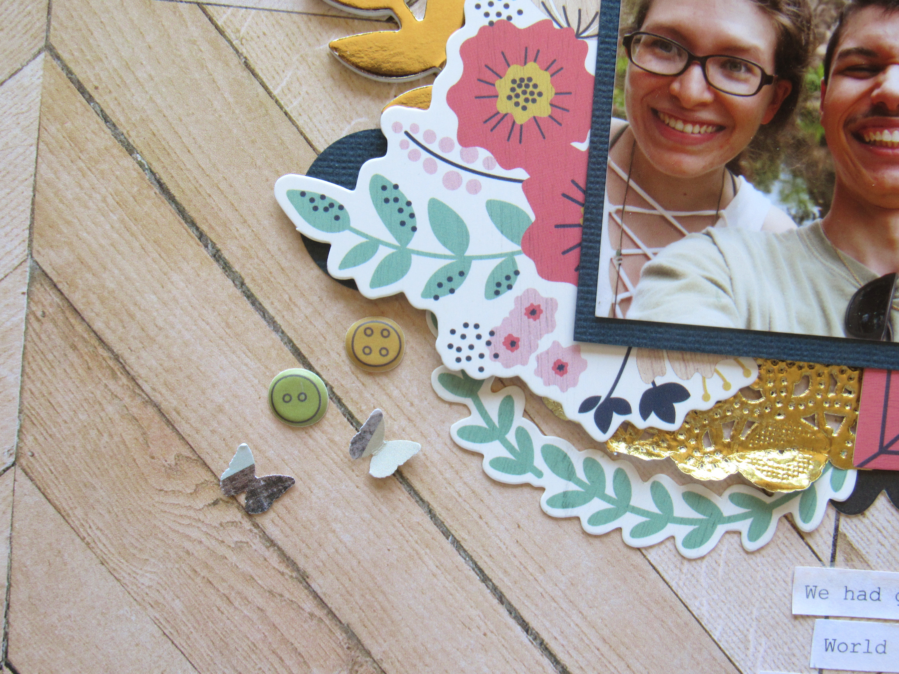
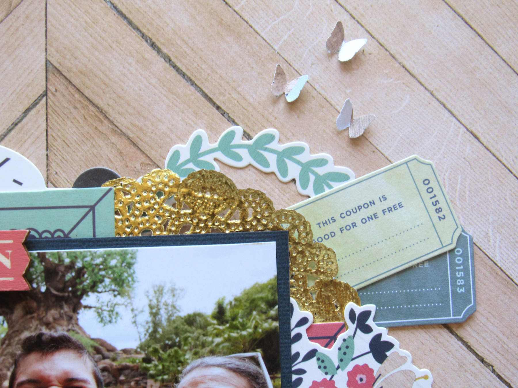
The layout came together rather quickly. Once I adhered everything down, the next challenge was adding a bit of a diagonal flourish, so that everything wasn’t so centered. I started off on the bottom left by placing some of the Hone I’m Home button shaped puffy stickers, but then added a few little butterflies I punched out of the Take Me Away pattern paper. I decided to add those same butterflies to the top right, so that it created a bit of movement in the layout. I ended up typing out my journaling and after printing it on white paper, I cut the sentences up into strips, gave them all a quick wash with some beige-colored watercolors, and them adhered them down on the bottom right side of the layout. Overall, I’m so happy at how this turned out! Be sure to check out the process video below to get a better idea of how this layout came together!
Products used: Hip Kit Club October 2016 Main Kit, October 2016 Embellishment Kit Add-on + October 2016 Cardstock Kit Add-on
